
1. Theory & Validation
The starting point was to breakdown the process of reporting a stolen bicycle and understanding the pain points behind it. This lead us to the first iteration of a product that would allow users to file reports from their phones. By registering their bicycle within the app, this would make the process of reporting theft simple as one click as all information would be stored within the app and used when needed.
Speaking with cyclists on their way to work or home, I learned that most of them wouldn’t file a police report if their bike was stolen because they either thought that bicycle recovery was a not a priority to the police or that they would never get their bike back regardless. They said they would have the most success searching Craig’s List or similar communities for the bicycle and attempting to meet with the seller to get it back.

People also talked about how strong and connected the bicycle community is. Cyclists share with and trust each other most on topics ranging from safest areas to lock up, which locks to use, and brands of bicycle. There is a bond and kinship between cyclists so they will look out for each other. One user shared an anecdote about not knowing anyone when they moved to DC and it was through biking to her job that she made her first friends in a new area. It was an instant connection and found people she could relate to. It made the city seem more welcoming and more like home.
2. Research & Understanding
With research to showing the importance on community, this overarching theme became the lighthouse to guide the feel and feature of the product. The scope narrowed to focus on four needs:

Researching the current marketplace, I found a few products that provided similar services but that still left a gap for the concept to succeed. 529 Garage is a community focused product with a proprietary sticker security system they retail. These stickers come with a code unique to the sticker and are difficult to remove. While the website is visually appealing, the information architecture is disjointed and the mobile app is overly complicated. Reporting a stolen bike is a stressful situation and so having to navigate and interact with a clunky and unintuitive app will only add more frustration and lead to lower participation.

Bike Shepherd offers a robust registration and resource system for their users. It’s focused is on bicycle recovery and enabling users to get their bike back or information on it as fast as possible. They offer a similar sticker system to 529 Garage and also have links to police databases for searching recovered bicycles. The website is very slow and has very long loading times when inputing and receiving information. Testing it with users, while they were excited about the services offered, they grew frustrated with repeating load times that felt excessive. The lack of a mobile application for Bike Shepherd leaves a large gap open in the market. The longer a user waits to report their bike stolen and getting other people on the look for it, the less of a chance they could get it back. This cemented that Asgard needed to launch in two platforms to best serve it’s potential user base.
3. Production & Presentation
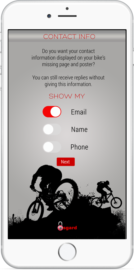
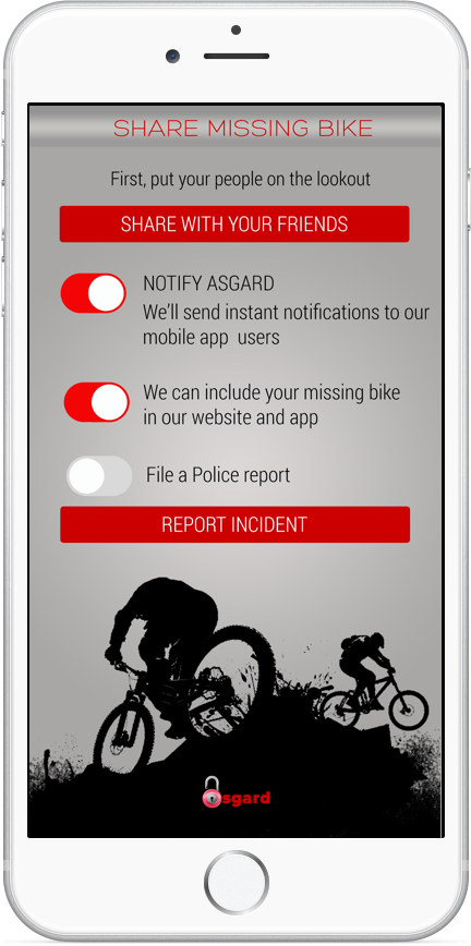
The client was using this is a proof of concept to attract investors for further development. A user reporting a stolen bicycle will most likely happen using their mobile device. We had to make sure that this interaction was straight forward and wouldn’t be an accessory to already stressful time. Content on each screen for this flow was focused to the minimum amount of decisions and interactions necessary.


The website would be a hub for users to find and share information related to city cycling. Initial concepts placed content placed content after the home page or logging in. It was too heavy and uninviting. Between the imagery and lack of content, most users didn’t want to engage with or learn about the service.
There was also no added value with this layout. What did the service provide? Why should a user sign up? What value does it offer to their lives? What type of experience should they expect? There are too many questions and next to no answers with this version.

Based on the feedback from users, we displayed content and value at the landing and let users engage into deeper levels of the service as they see fit. I wanted to use comfortable and popular content organization to breed familiarity and increase user engagement. Using asymmetrical tiles to establish hierarchy and scannability of the landing page, users found it more engaging and easier to locate content they wanted.
I asked users about the meaning of the community spotlight. I wanted to know how they would define it and what are the variables that determine how someone is shown there. Users reported back that these are people they could trust and people who made frequent and substantial contributions to the community.
Users also reported that they'd like to see the spotlight higher on the page. This is something that should be above fold with how strong and close knit the cycling community is. This would help really emphasize the importance and dedication to the community from the product and help build trust and loyalty.
Presenting to the client, I stressed the importance of community and simple interface. The cycling community is very large and frequent sharers. Curating a hub for them to help each other and themselves is extremely attractive to possible users. Interacting with each other should fee like an extension of the cycling experience itself.
Interface simplicity will be a deciding factor in user participation and overall product success according to research. Designing and creating a product that will be used in situations where the user is going to be angry, upset, frustrated, or anything other then clear headed is very complicated. The upmost care and empathy is a required to create a service to help alleviate some of those feelings. A core UX goal is to make interactions and designs as intuitive as possible but this becomes exponentially more important and difficult when for a user to use a critical feature of your product they have to be in a bad mood. I advised that to allotting a large share of time and resources to user testing future iterations in scenarios constructed to be frustrating to determine these thresholds.
The visual design and branding of web and mobile differ because of time constraints and a desire to provide multiple options. This decision was not effective and became a distraction in the big picture. This was a strong lesson in pulling back the levels of fidelity within the project to maintain a consistent look and feel. Within a brand, there must be a consistent look and feel within all products that fall under the umbrella. User recognition and comfortability cannot be emphasized enough in increasing and preserving customer loyalty.