
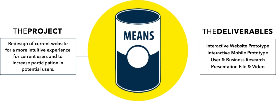
The Kickoff
MEANS is a DC non-profit whose mission is to bridge the gap between food donations and food banks. Through an online matching system, donors post available food to the database, and the system sends email notifications to food banks whose specifications (distance, food type, size, etc.) meet the donation requirements. Using a first come first serve method, MEANS provides contact information to both parties when a match is established. The responsibility then lies with the claimant to initiate contact and pick up the donation, unless stated otherwise.
When first meeting with our client, we wanted to understand their company values and their perspective on the problems with the current model. Our client set minimal constraints on our designs but did task us with three key goals:

Our client spoke about the importance of allowing, supporting, and encouraging users to interact with the system through mobile devices. The current website was not responsive and did not allow for optimal and sustainable use. While the service MEANS provides is important, it’s critical that users spend minimal time using it to ensure consistent participation. Finally, users need to feel at every step of the way that MEANS is always acting in their best interests. We needed to create lasting brand image with the look and feel of the site so that people intuitively knew they were in good and capable hands.
When our client walked us through how the system worked, we had questions about future plans to offer donation transportation. It seemed like a sensible next step, currently being the middleman in providing connections between two parties, that transporting the donation between parties would be integral part of the service. Our client had previously thought about this, but encouraged us to explore it further.
By the end of our first client meeting, we were met with the stark truth that our initial hypothesis for the project was completely wrong.

From our outside perspective, we suspected the problem was that there isn’t enough food for people who are hungry. We believed food banks are constantly struggling with resources because there is never a shortage of mouths to feed. Instead, we realized there are too many donations not reaching the people who need food the most. Comparatively, this is an even bigger problem: we actually have the resources to feed people, but lack the means to connect food to those in need. Understanding where the breakdowns were in food bank participation would be paramount in creating an effective and lasting solution.
The Who
We were working with two user bases who, for the most part, had two very different levels of comfort with technology. With the donor side being small to medium businesses who are tech savvy, the food bank side was populated with mostly retired volunteers. These users could find technology intimidating, complicated, and/or of minimal value. Our design had to carefully tip toe the line between modern and familiar.
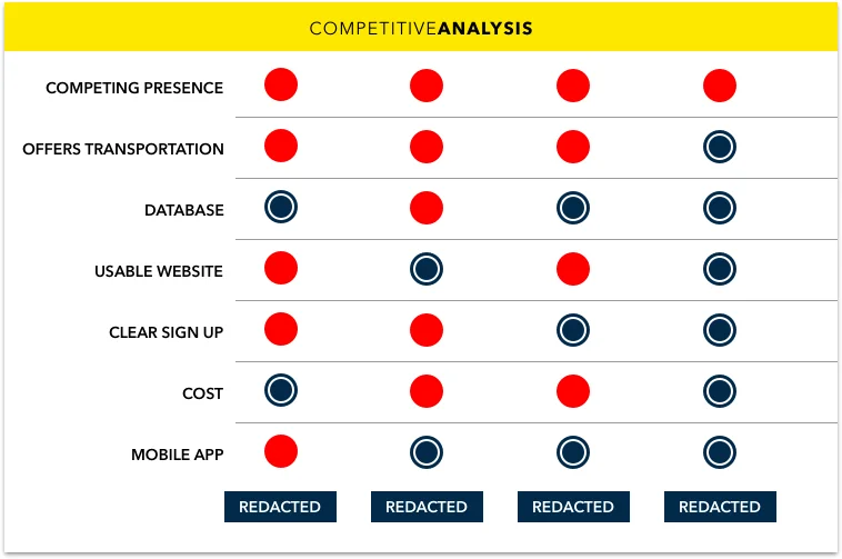
I jumped into a competitive analysis to understand the market both locally and nationally. I primarily found services providing one or two features, but not much else. They were focused in their audience but lacking key essentials in providing a good user experience. From easy sign up to a usable website, the fundamentals were not in place to maintain or grow their user base. The one outlier was a startup that was similar to our client that was providing one key feature: donation transportation. This was a fascinating turn of events as we had questioned our client about this in our first meeting. We returned to wondering if the current onus on the recipient to retrieve donations was preventing more food banks from participating in this service?
The Investigation

I interviewed five D.C. food banks to learn about their day to day operations and understand the inner workings of a food bank. This provided key data on the demographics they serve, the people they employ, what kid of technology they currently use and if they would be interested in using a service like MEANS. I learned that there are many variables involved in handling and providing food, not to mention other charitable donations. Factors ranging from proper food storage to thorough cataloging of ingredients create natural bottlenecks in the food bank intake process. Additionally, finding the resources to pick up donations is difficult and usually only done for regular contributors or a parcel of sufficient size, worth, and need. Understanding the challenges food banks face, my partner and I could design with a much more narrow focus to fit the needs of the present instead of the future.
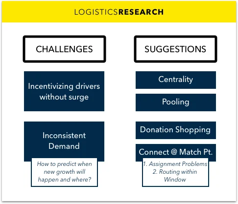
The biggest take away from our food bank research, was the issue of transportation. We came away with hard evidence supporting our hypothesis that donation transportation was a critical issue with MEANS. Diving deeper, I interviewed a local ride sharing service about the logistical challenges with transportation services. Learning about the challenges they faced getting their business off the ground shed light on the similar challenges our client would face if MEANS began offering donation transportation. The takeaways were huge but the overarching theme was the size and scale that logistical problems and thus their solutions present. This changed our problem statement again as we attempted to wrap our heads around the complexity of what we were solving.

The Awakening
My partner and I had a discussion about what this problem statement really meant. The implications were huge: would we need to create a standardization to the food donation process? What would that entail, and would those types of constraints actually decrease donor participation and/or usable donations?
The list of questions and variables were endless and yielded a scope that was not manageable for our three week sprint. Essentially, we were trying to solve the hunger crisis itself and that - noble as it is - was not our job. We took a step back and reminded ourselves who were designing for: the users.

The Prototype
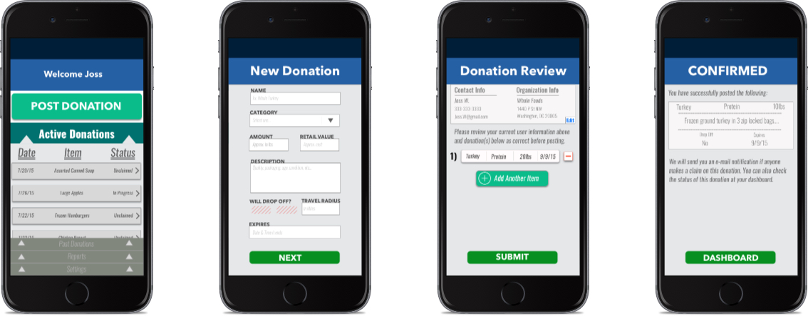
With a focused problem statement, our ideation process sped up. Because our research phase lasted longer than expected, we made up time with me creating mockups in sketch and handing them off to my partner to turn them into a prototype in keynote. We focused on expediting the sign-up process to increase food bank participation within MEANS, because the current bounce rate was staggeringly high. We broke the current sign-up process into sections, getting the minimal information from new users to access the system and back-loading the user-specific filters for donation notifications. We wanted to show users the value in providing the additional information instead of simply asking for it up front in a cumbersome sign up process. While my partner conducted usability testing at a few food banks, I started creating some responsive mobile mock ups to satisfy our client’s request.


The Future
We left our client with a list of next steps they would need to address to ensure the growth and success of their company; the biggest one being the exploration of providing transportation between donor and recipient. We found evidence that transportation was needed, but implementation requires extensive research and capital to be done correctly. On a suggestion from an interview, we recommended they reach out to local universities to applied maths student(s) to help development of logistics and optimization in a cost effective manner. Finally, we recommended creating a volunteer database to house the scheduling for food banks and allow drivers to sign up to deliver donations.